The argument in favor of using filler text goes something like this: If you use real content in the Consulting Process, anytime you reach a review point you’ll end up reviewing.
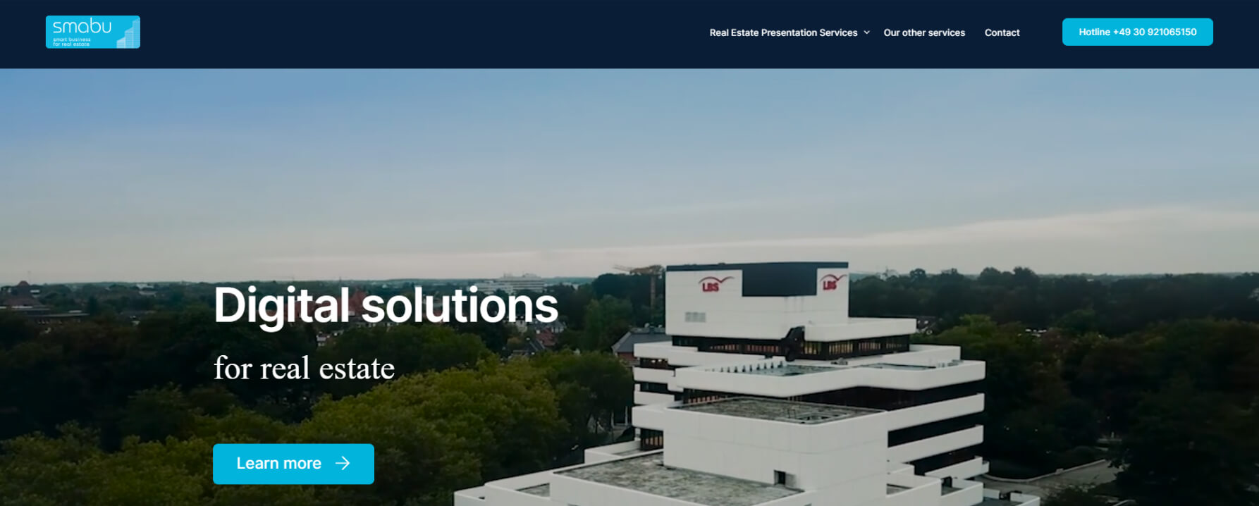
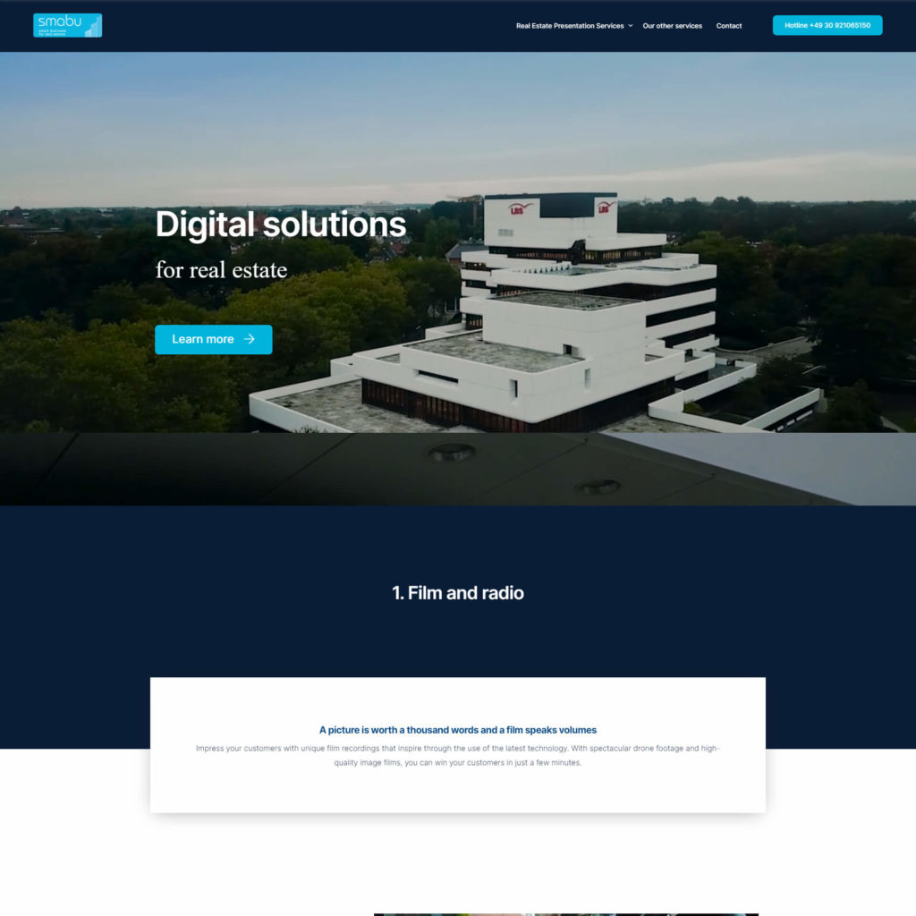
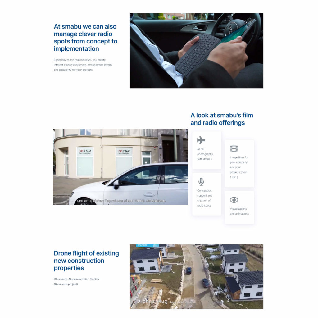
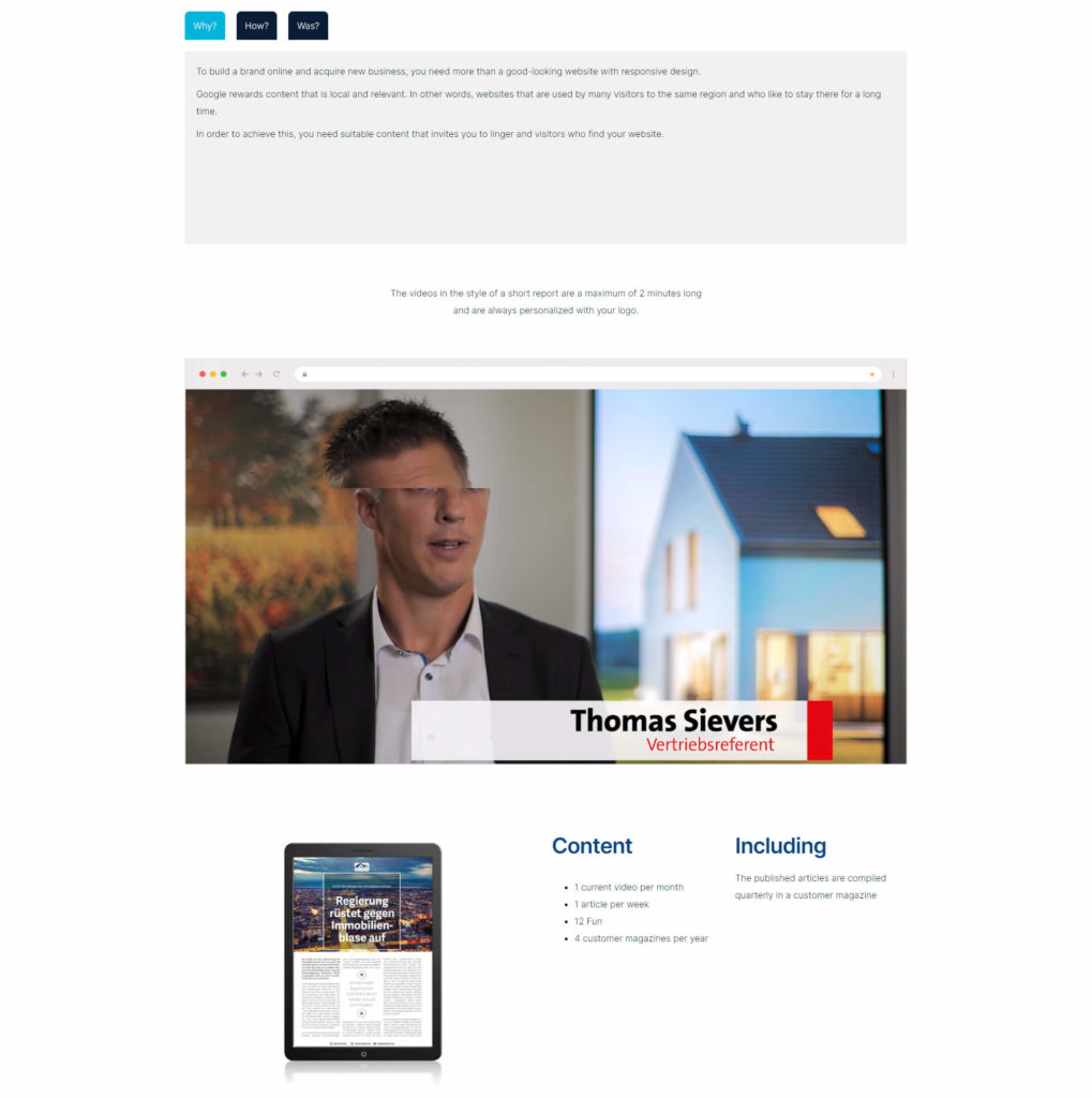
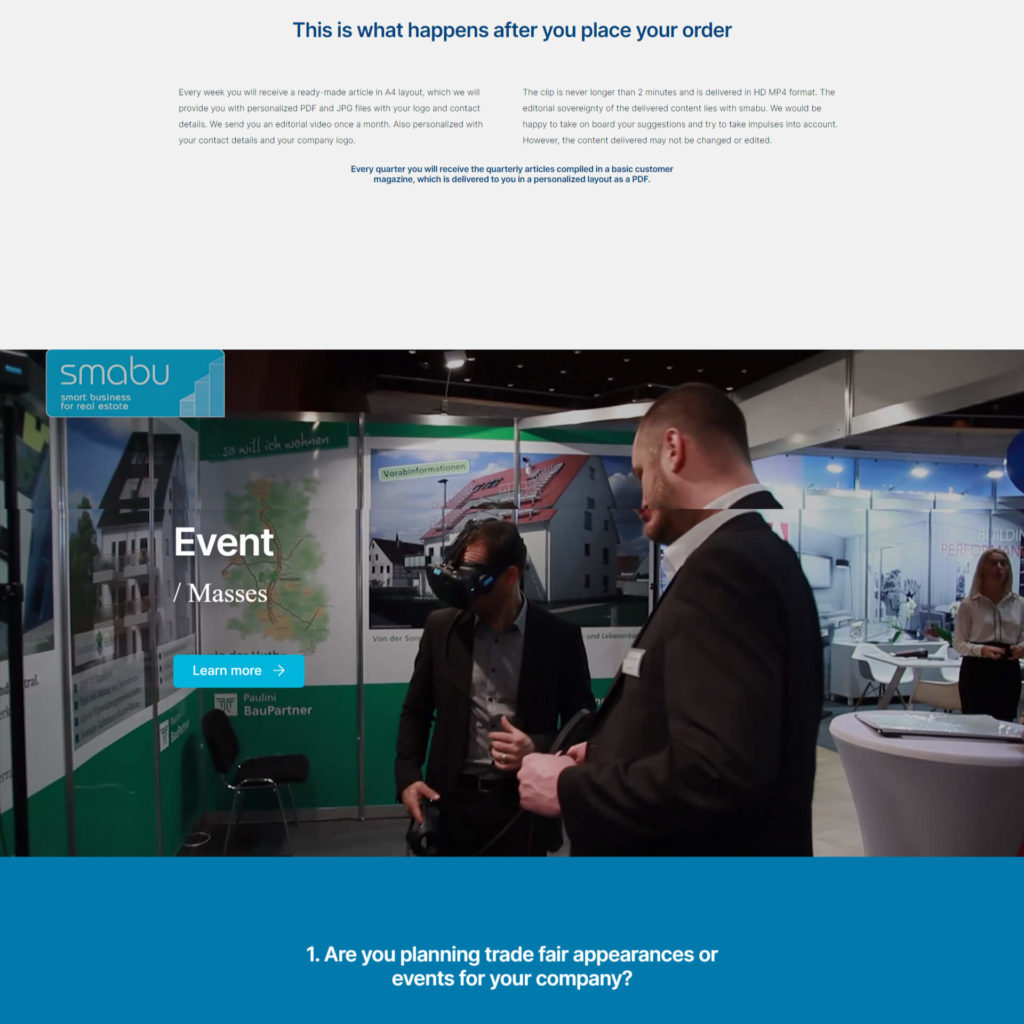
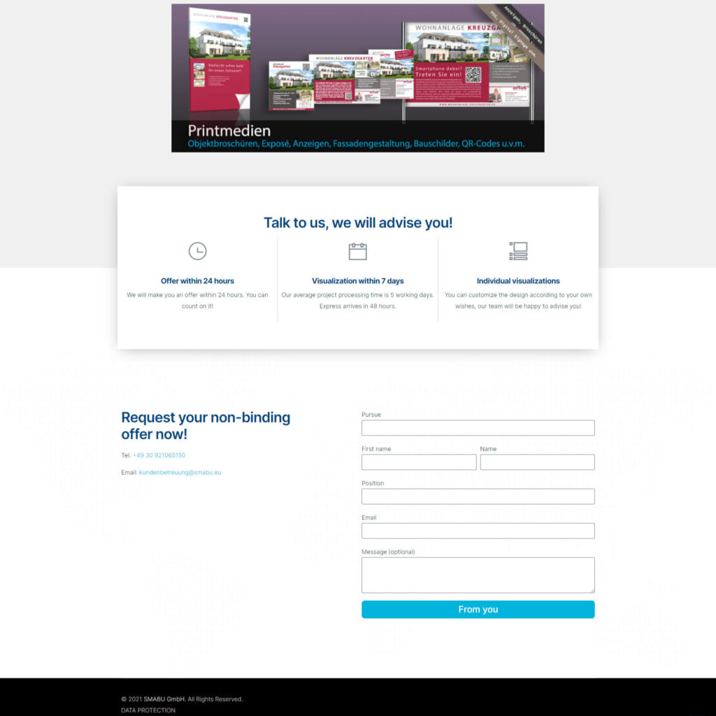
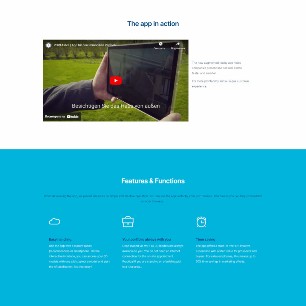
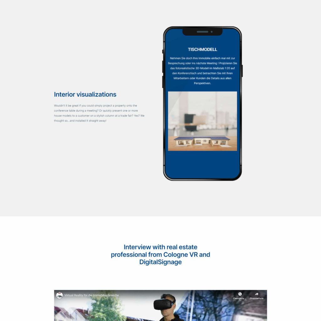
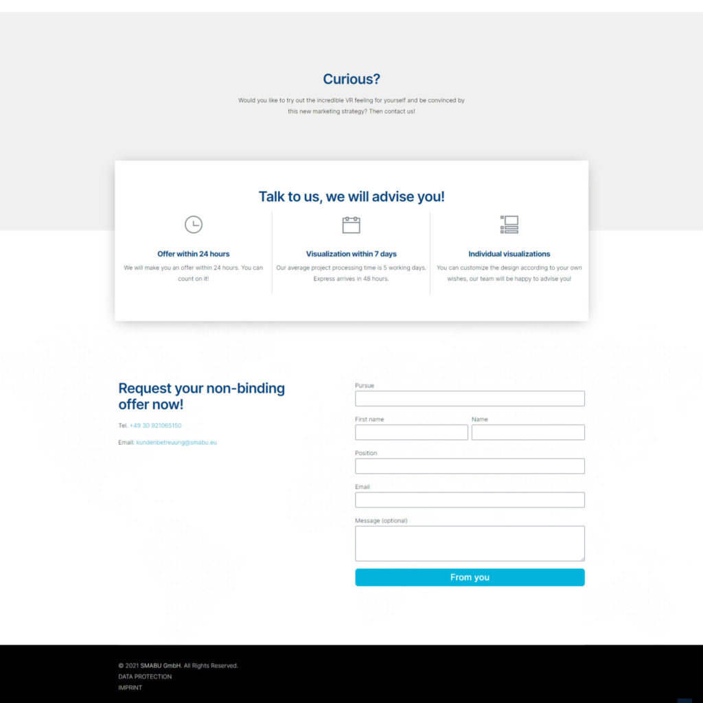
A client approached us with the task of creating a multi-page website for a company creating visualization and virtual reality projects for b2b. It was necessary to create a modern, stylish, simple and understandable interface that would help present the full range of company services
One of the features was the task of making clear positioning of all sections according to relevant categories. In addition, the task was to correctly display all modules on any device, both desktop and mobile.
The Results
We have designed the site in such a way that it corresponds to modern trends and at the same time is as simple as possible for users to understand. It turned out exactly as the client intended.
First, we conducted an in-depth analysis of current trends and collected best practices from related fields. After agreeing on the styles and roadmap, we made a version for desktop devices, where on the main page you could see the necessary information about the company’s services and its advantages for a successful b2b partnership.
As a result, we developed the main sections of the service, adapted the versions to fit all modern device screens, and the client was very pleased with the result.